Designing Data for Designers
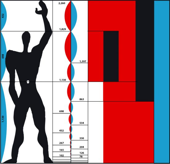
Architects and engineers are certainly no strangers to conveying complex ideas with drawings. But the art form has come a long way since Vitruvian Man and Corbusier’s Modulor. Data visualization can communicate abstract concepts with depth and clarity. To keep your infographics from becoming infauxgraphics, here are some tips on using them effectively in presentations and proposals.
1. Remember Who You Are
It’s easy to get carried away with the design of infographics, but don’t forget they are part of your communications strategy. Keep colors and type fonts consistent with those used in your corporate identity program.

2. Simple is Good
If the visuals are too complicated or esoteric, they’ll overwhelm—instead of enlighten—your audience. Focusing on a finite set of data to illustrate will allow people to absorb your content accurately and without distraction.
3. Use Sparingly
Despite the maxim about pictures and 1,000 words, even the best infographic is no substitute for a well-written paragraph or concise bullet list.
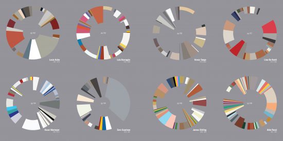
4. Amaze
Given the mind-stretching technological capabilities of data visualization tools, the occasional graphic indulgence can make a presentation memorable. Case in point: Frank Jacobus’ depiction of architects’ most favored materials, excerpted from his book Archi-Graphic.
Interested in learning more about the art and science of infographics? Here are a couple sources:
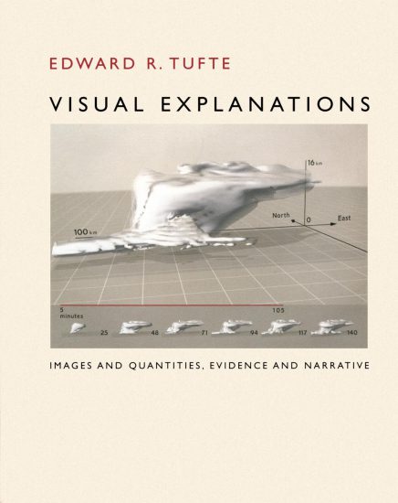
Called the “Leonardo da Vinci of Data” by The New York Times, Edward Tufte is a statistician, artist, and Professor Emeritus of Computer Science at Yale. His now-classic books on data visualization are both beautiful and fascinating.
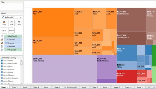
Tableau offers a straightforward yet powerful tool for translating data into smart and aesthetic visuals. Incorporating an interactive dashboard, applying data filters, on-screen comparisons and trend analysis are just some of the functions that can animate your images.