Learning from Olympics Logos
In addition to being a global sports spectacular, the Olympics (at least in the modern televison-era) is known as an arena for marketing and merchandising sponsorship. This commercial aspect of the Games is just as competitive as the athletic component. Swoops, arches, apples, and more: graphic logos abound on every surface, vying for attention. In a way, this is historically appropriate; the Olympics are Greek in origin, and logos is a Greek word meaning “word.”
Successful logos have some core qualities. They are simple, cleanly rendered images. They are memorable; it’s important to create a distinct and lasting impression. Logos avoid trendiness, which makes a design—and by extension, the company it represents—look dated and out of touch. A timeless look will communicate the message most effectively. The image must be versatile. This means it should be suitable for a wide variety of uses: for small and large applications, reproduced on different materials, in black-and-white as well as in color. Finally, a logo should be appropriate to the business. The mark ought to convey something meaningful about the company and its values.
The good sports at AIGA gave us permission to share some of designer Milton Glaser’s thoughts on Olympics logos. Here, we’ve excerpted a few of his comments on some winning imagery…

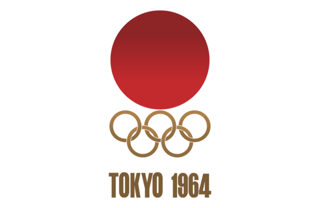
Tokyo, Summer 1964
Appropriately redacted and without any confusion. The parts fit. Score: 92 out of 100

Athens, Summer 2004
The olive branch representing the games is executed in a fresh and unexpected way. Because it looks less like a corporate logo, we feel more affectionate toward it. The blue feels right reflecting both the event and Athens at the same time. Score: 90 out of 100

Barcelona, Summer 1992
This mark is unexpectedly convincing. The 3 strokes representing the human figure have a good scale relationship to the world ‘Barcelona ’92’ and the rings. Score: 85 out of 100

Rio, Summer 2016
A presentation that looks fresh and contemporary. The athletes joining hands at the top are executed in a way that works well with the other elements. It feels like something new. Score: 85 out of 100
…and his observations on some less successful logos:

Paris, Summer 1924
Bad beginning, the elements are unrelated visually and the imagery is confusing. The surprinted lettering is unreadable. Score: 20 out of 100

Berlin, Summer 1936
Strange and lacking focus. The Olympic rings become subordinated to the eagle and bell forms. The spirit of the Olympics is totally absent. Score: 20 out of 100

Los Angeles, Summer 1932
A visual disaster; combining the rings, a laurel leaf and the American shield in an overlapping pattern is impossible. The typography goes on its own unrelated way. Score: 25 out of 100